Works Graphic / Web
採用ブースのデザインで、学生の足は止まるのか。 Works|Graphic
採用イベントでこんなお悩みありませんか?
・合同説明会に出ても学生がブースに来ない
・周囲の企業ブースに埋もれてしまう
・パンフレットはあるけれど、まず立ち止まってもらえない
・採用活動に力を入れているのに、応募につながらない
採用活動では、企業の魅力そのものだけではなく、
「まず興味を持ってもらう入り口づくり」 がとても重要です。
今回ご相談いただいた課題
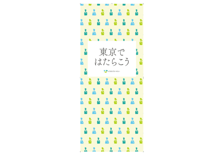
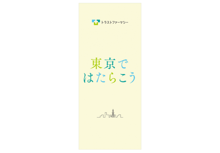
今回ご相談いただいたのは、地方で開催される新卒採用企業説明会で使用する展示会バナー制作でした。
クライアント様の課題はシンプルでした。
「遠くから見ても学生の目に入り、興味を持ってもらいたい」
多くの企業が並ぶ採用イベントでは、企業の情報より先に、まず視認されることが必要になります。
デザインの前に考えたこと
私たちは、すぐにデザイン制作には入りません。
まず考えたのは、「その場で学生は何を見ているのか」
地方開催の採用イベントという背景を考えたときに、
学生にとって東京で働くことは一つの未来の選択肢になります。
そこで設定したメッセージが
東京ではたらこう。
単なる会社説明ではなく、学生自身が未来を想像できる言葉を設計しました。
デザインは目立つだけでは意味がない
今回、複数案を提案しました。
ひとつは、「たくさんの先輩があなたを待っています」という安心感を伝える構成。
もうひとつは、遠くからでも一瞬で言葉が届く視認性重視の構成。
採用ブースのデザインは、きれいに作ることが目的ではありません。
人の行動を変えることが目的です。
採用ツールは、作る前の設計で変わります
エフェクトでは、
・採用パンフレット
・展示会バナー
・採用サイト
・会社案内
・動画制作
・ブース装飾
単体のデザインではなく、「どうすれば応募につながるか」という視点で整理しながら制作しています。
デザイン会社というより、企業の伝え方を整えるパートナーとしてご相談いただくことが多いです。
こんな企業様はぜひご相談ください
✓ 採用活動を見直したい
✓ 今ある採用ツールがバラバラ
✓ 学生に自社の魅力が伝わっていない気がする
✓ 何を改善すればいいかわからない
✓ 採用広報を整理したい
伝える前に、整える。
採用活動では、「何を伝えるか」より先に「どう伝わるか」 を整える必要があります。
エフェクトでは、企業の情報や魅力を整理し、伝わる形に変えていきます。
採用ツールや企業コミュニケーションのご相談はこちら
「今ある採用ツールを見直したい」
「何から改善すればいいかわからない」
そんな段階でも大丈夫です。
お気軽にご相談ください。

内容 : 合同採用展示会バナーデザイン制作
仕様 : w850 × h2000
Designer : Hiroshi Nishimura


