Works Graphic / Web
不動産会社の会社案内デザイン|地域で選ばれるためのパンフレット制作事例 Works|Graphic
不動産会社の会社案内は、会社を紹介するためだけのものではありません。
「安心して相談できそう」
「この会社なら任せられそう」
そんな第一印象をつくる営業ツールです。
今回ご紹介するのは、地域に新しく開業する不動産会社様の会社案内パンフレット。
私たちはデザインを考える前に、
「地域の人にどんな印象を持ってもらうべきか」を整理するところからスタートしました。
課題
今回のご相談は、
「開業することを地域の方に知ってもらいたい。」
「新聞折込やポスティングでも埋もれないパンフレットにしたい。」
というご要望でした。
不動産会社は数多く存在します。
その中で選ばれるためには、物件情報よりも先に、
「この会社なら相談しやすそう」という印象づくりが重要になります。
私たちはまず、競合との差別化ではなく、
地域の方が初めて手に取った瞬間の印象を設計しました。
デザインの考え方
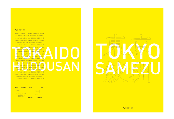
表紙にはあえて鮮やかなイエローを採用しました。
ポストには毎日多くのチラシが届きます。
その中で目に留まり、「ちょっと開いてみよう」と思っていただくことを最優先に考えています。
目立たせることが目的ではありません。
地域に新しく誕生した会社の「はじめまして」という前向きな印象を伝えるための色です。
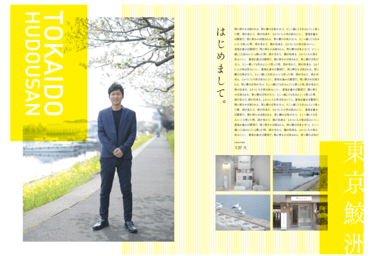
中面では写真や情報量のバランスを整理し、会
社の雰囲気やスタッフの人柄が自然に伝わる構成にしています。
私たちが考えていること
会社案内は、デザインが目的ではありません。
誰に、何を、どんな順番で伝えるか。
そこが整理されて初めて、デザインは機能します。
私たちは「伝える前に、整える」という考え方を大切にしています。
企業の魅力を整理し、相手に伝わる形へ変えていくこと。
それが私たちの仕事です。
こんな会社様におすすめです
・新しく会社を立ち上げた
・地域で認知を広げたい
・営業で使える会社案内を作りたい
・Webサイトとパンフレットの印象を揃えたい
・自社の強みがうまく伝えられていない
パンフレットを作る前に、一緒に整理しませんか。
会社案内は、ページ数やデザインだけでは成果は変わりません。
・誰に伝えるのか。
・何を伝えるのか。
その整理からお手伝いしています。
パンフレット制作だけでなく、会社紹介、Webサイト、営業資料まで一貫してご相談いただけます。
「まず何を作ればいいかわからない」という段階でも、お気軽にお問い合わせください。
内容 : 会社案内パンフレットデザイン
仕様 : A4 12p
Designer : Hiroshi Nishimura
Copywriting : Hiroshi Nishimura


