Works Graphic / Web
瓦斯会社 会社案内パンフレットデザイン Works|Graphic
ガス会社様の企業価値を伝えるコーポレートパンフレット制作
企業の魅力を正しく伝えるために欠かせないのが、会社案内パンフレットです。
会社概要や事業内容をまとめるだけではなく、企業の価値や信頼感を視覚的に伝えることが、会社案内パンフレットデザインに求められています。
今回は、関東圏でガス供給事業を展開されている企業様よりご依頼いただいた、会社案内パンフレットデザイン制作事例をご紹介します。
ご依頼内容
毎年制作している会社案内パンフレットを刷新したい
今回ご相談いただいた企業様では、毎年会社案内パンフレットを制作されており、新しい年度に向けたリニューアルプロジェクトとしてデザインコンペが実施されました。
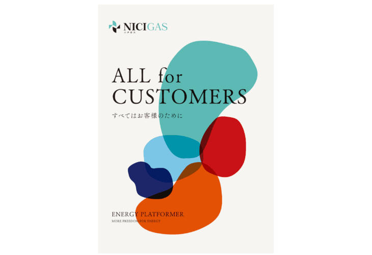
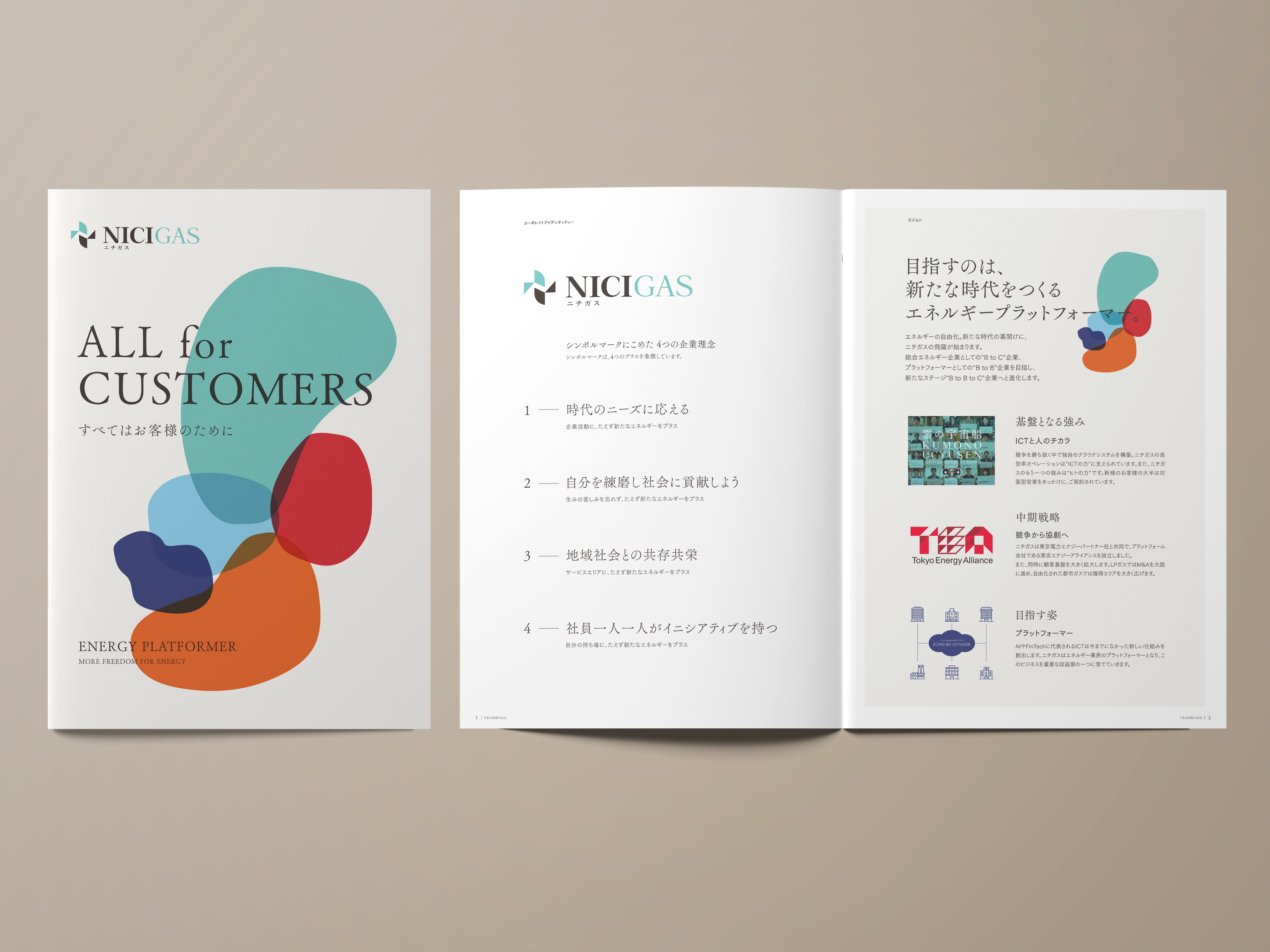
打ち合わせの中で最も重視されていたのは、「第一印象に残る表紙デザインにしたい」という点でした。
会社案内は営業活動だけではなく、採用活動や取引先への企業紹介など、企業ブランディングの役割も担います。
そのため今回は、企業の印象形成を意識したパンフレットデザイン制作を進めていきました。
デザインコンセプト
変化し続ける企業をデザインで表現する
クライアント様のご要望として、明るく印象に残る色使いがありました。
この企業様では5つのコーポレートカラーを使用されていたため、そのカラーをデザイン全体の軸として設計。
ガス会社として地域インフラを支える安定感を持ちながらも、時代に合わせて柔軟に変化し続ける企業姿勢を視覚化することをコンセプトにしました。
表紙デザインでは色彩を大胆に使用し、アート性のあるレイアウト構成を採用。
さらに、日本らしい形状を連想させるビジュアルを取り入れながら、企業の公共性や地域とのつながりも表現しています。
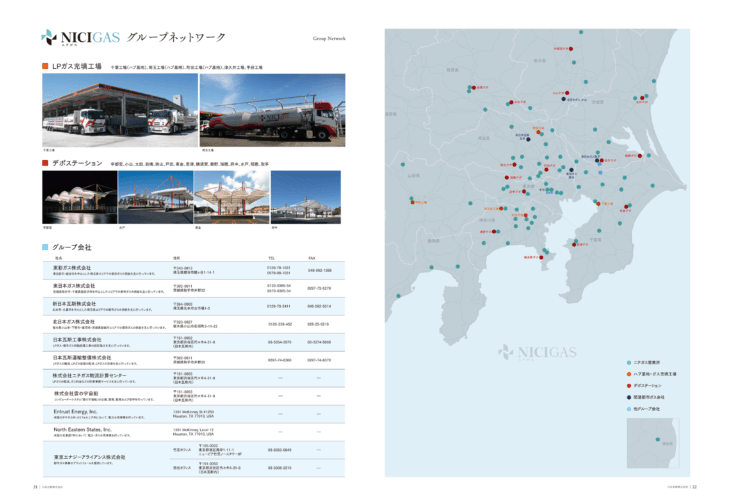
中面ページデザイン
情報を整理し、伝わる流れを設計する
企業パンフレットは情報量が多くなりやすく、読み手が途中で内容を整理できなくなることがあります。
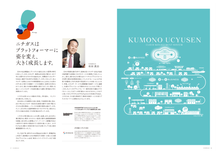
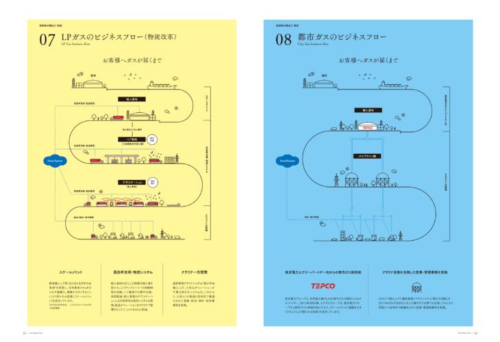
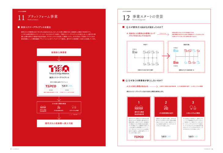
そこで今回のパンフレット制作では、中面ページごとにコーポレートカラーを切り替えながら構成を設計しました。
ページをめくるたびに色が変化することで、
・事業内容の切り替わりがわかりやすい
・情報のカテゴリーを視覚的に認識しやすい
・最後までストレスなく読み進められる
という効果を生み出しています。
会社案内パンフレットは情報を載せるだけではなく、情報設計そのものがデザインだと考えています。
パンフレットデザイン制作で大切なこと
企業には、それぞれ独自の強みがあります。
しかし、その価値は情報を並べるだけでは十分に伝わりません。
私たちが大切にしているのは、
・企業の情報を整理すること
・伝わる順番を設計すること
・伝わる形に変換すること
です。
今回の会社案内パンフレットデザイン制作では、クライアント様の持つ
「信頼性」
「柔軟性」
「企業としての力強さ」
を視覚的に伝えることを目指しました。
パンフレットデザイン制作をご検討の企業様へ
会社案内パンフレットは、企業の第一印象を決める重要なコミュニケーションツールです。
私たちは、ただパンフレットを制作する会社ではありません。
企業が持つ情報を整理し、
伝わる順番を設計し、
人に届くコミュニケーションへ変えていく。
見た目を整えることではなく、
企業と人との間にある「伝わらない」をなくしていくこと。
それが、私たちeffectの考えるデザインです。
■ 仕様内容
内容 : 会社案内パンフレット制作
仕様 : A4 24p
制作期間 : 約 3ヶ月
Art Direction : Hiroshi Nishimura
Design : Hiroshi Nishimura


