Works Graphic / Web
鍼灸院 チラシデザイン Works|Graphic
ポスティングするチラシデザイン
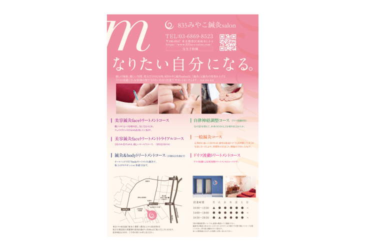
「捨てられないように」をテーマに考えていきました。表面に情報やイメージを配置し、大きく「なりたい自分になる」のキャッチコピーを考え、サロンのカラーをメインに優しいイメージでデザインを制作していきました。
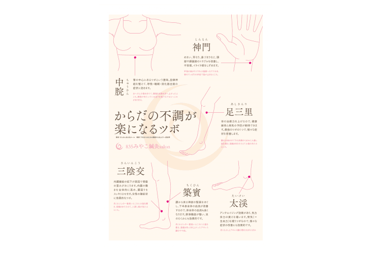
裏面に「からだの不調が楽になるツボ」として、自分でできるツボ押しをイラスト化し、ちょっとした時にでもチラシを見てもらったり、冷蔵庫に貼っておいてもらったりと、とっておいて損はないなと思ってもらえるようにしています。
Flyer design to post
The theme was “Don’t throw away.” I placed information and images on the surface, and I made a design of the salon color with an image friendly to the main color, considering the catch phrase of “I would like to be myself”.
On the back side, I illustrated the pressure that I could do on my own as “the point where the body’s upset eases”, and even if it was a little time to look at the flyer or put it in the refrigerator, I won’t lose it. I try to get you thinking.

内容 : チラシデザイン
仕様 : A4 両面
紙質 : 印刷データ納品
Concept : Hiroshi Nishimura
Designer : Hiroshi Nishimura


